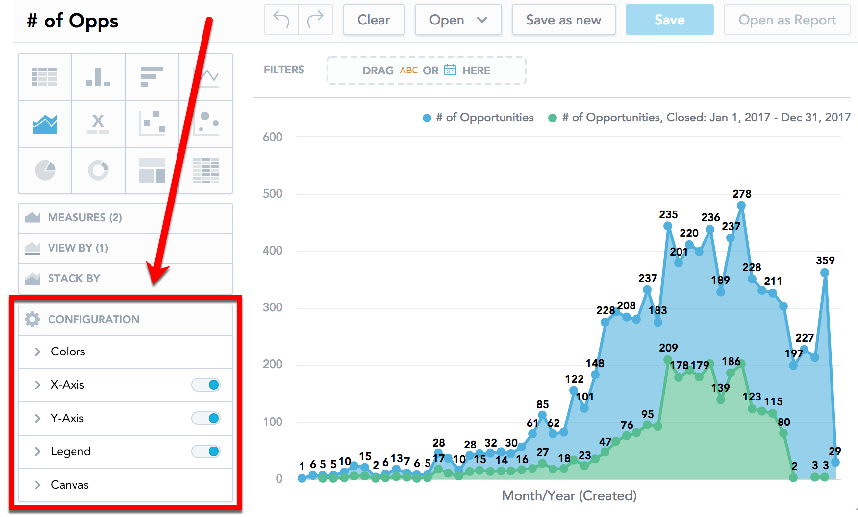
Configure Insight Properties
Analytical Designer allows you to change the default properties of your insights. You can show or hide axes, disable gridlines, rotate labels, change colors, and so on.
You can change the properties in the Configuration section when creating an insight.
Axes
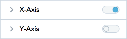
- To hide or display axes, toggle the switch for the x-axes and y-axes.
If you enable a secondary axis for bar charts, column charts, or line charts, you can configure the secondary axis here as well. For details about the secondary axes, see Bar Charts, Column Charts, and Line Charts.
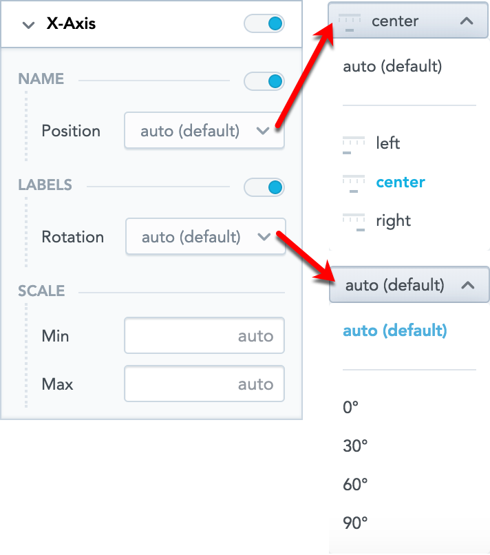
- To change the display angle of the axis values, select the angle in the Rotation dropdown list.
- To hide or display the axis name, toggle the switch for Name.
- To change the position of the axis name, select the option in the Position dropdown list.
- To set the minimum and maximum values for an axis, type the values in the Min and Max fields.
Legend
- To hide or display the legend, toggle the switch in the Legend section.
- To change the position of the legend, select the position in the dropdown list.

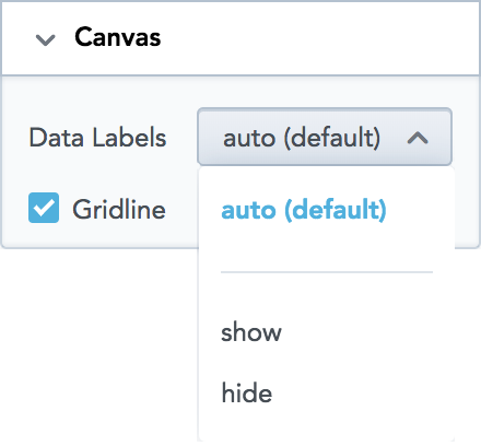
Canvas
- To show or hide the data labels, select the option in the Data Labels dropdown list.
- To show or hide the gridline, select or unselect the Gridline option.
Change Measure and Attribute Colors
Analytical Designer assigns colors for measures and attributes in a fixed order. The first measure/attribute in the Measure(s) section is assigned the first color from the palette (the default one or your custom palette).
For each measure/attribute in your insight, you can change the color in which the insight displays it. For example, you want to display Opportunities won in green and Opportunities lost in blue.
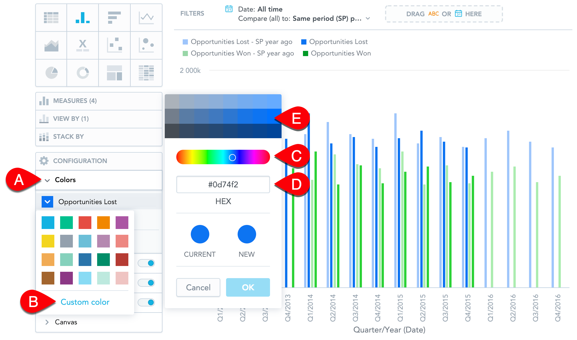
Steps:
In the Configuration section, click Colors (
Ain the image above).Click the measure/attribute that you want to change.
Select a new color, or click Custom color (
B) to adjust the current color.You can select another color form the picker (
C), enter a hexadecimal code for a new color (D), or select a different shade of your color (E).
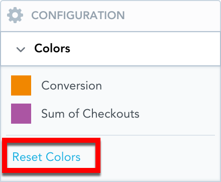
To revert to the original colors, go to Configuration → Colors and click Reset colors.
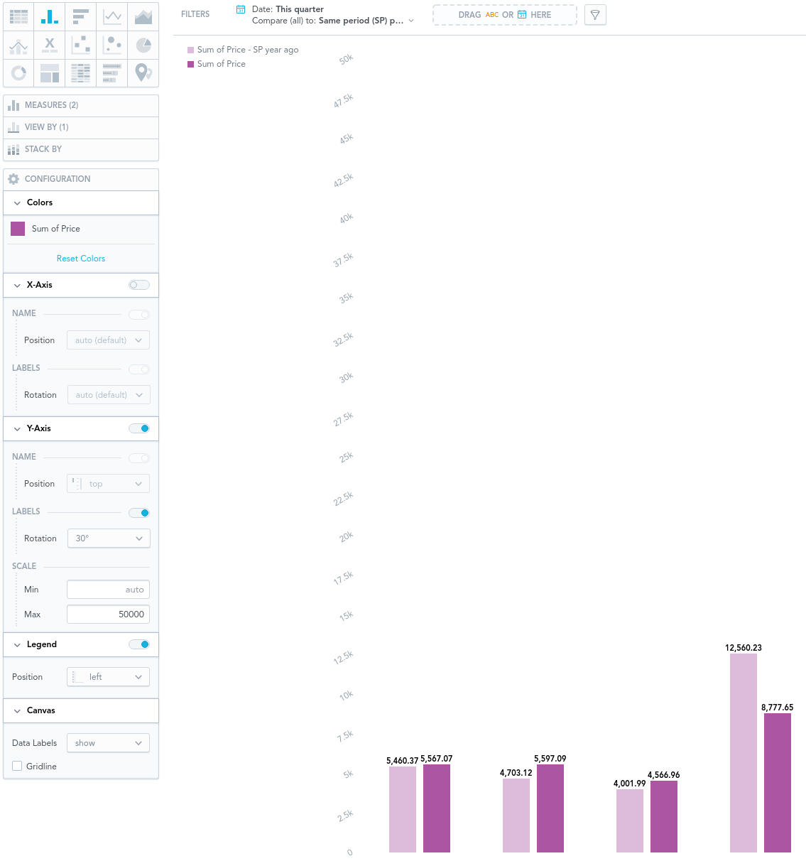
Example
The image below shows a column chart that has:
The color of the measure changed
The x-axis switched off
The labels on the y-axis (left) rotated by 30°
The scale of the y-axis (left) set between 0 and 50000
Dual x-axes are available for line charts. Dual y-axes are available for bar charts and column charts.
For details, see Bar Charts, Column Charts, and Line Charts.
The legend placed to the left of the insight
The data labels displayed
The gridline hidden