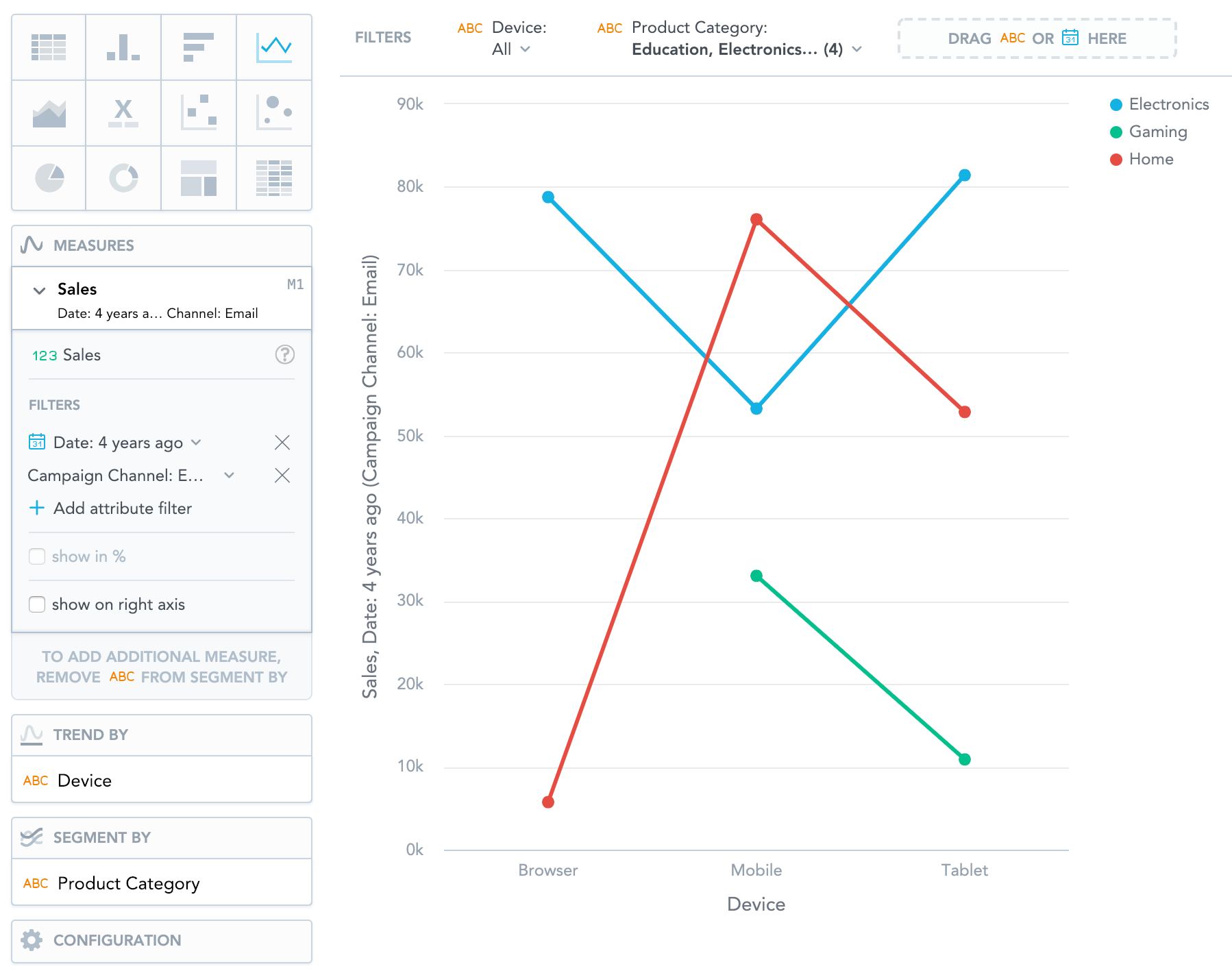
Line Charts
Line charts show data as line-connected dots. Line charts can display changes in measures across time or progress across a series of stages.
Line charts have the following sections:
- Measures
- Trend by
- Segment by
- Configuration
If you configure the Trend by section and add a date or an attribute, you display a trend line. Trend lines connect individual measure/attribute values.
In line charts, you can also:
Display the values as a percentage.
To do so, add a date or an attribute to the Trend by section.
Display individual values of an attribute.
To do so, add an attribute to the Segment by section. You must have only one item in the Measures section.
Compare your data to the previous period or the same period of the previous year.
For details, see Time over Time Comparison.
Display a secondary y-axis on the right side.
To do so, select the show on right axis checkbox in a measure’s settings.
For information about common characteristics and settings of all insights, see Insight Types.