Column Charts
Column charts have the following sections:
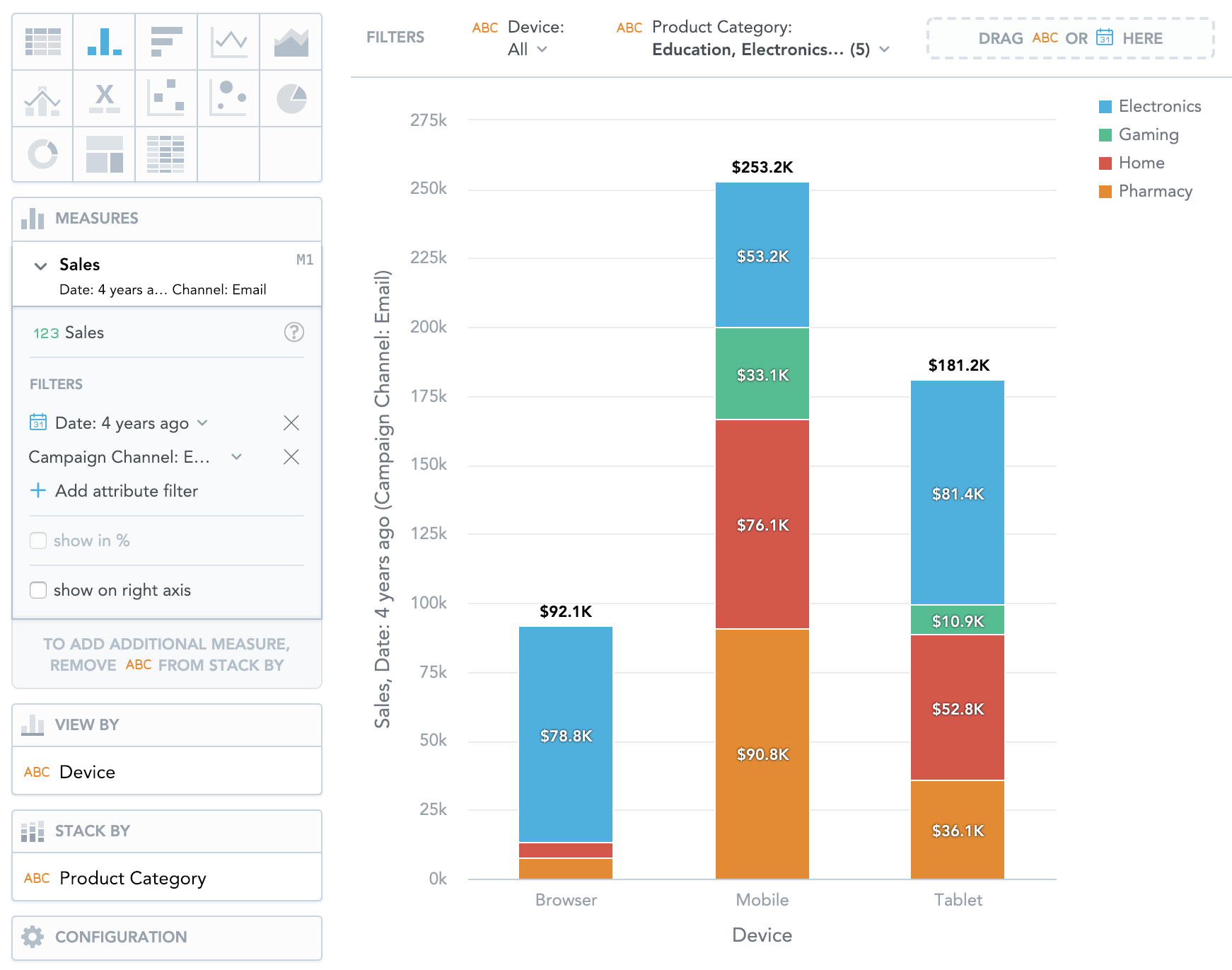
- Measures
- View by
- Stack by
- Configuration
In column charts, you can also:
Display the values as a percentage.
To do so, add a date or attributes to the View by section.
Stack the chart by attributes.
To add attributes to the Stack by section, you must have only one item in the Measures section.
If you have multiple measures in the Measures section, you can stack the measures. For details, see Stack Measures.
Compare your data to the previous period or the same period of the previous year.
For details, see Time over Time Comparison.
Display a secondary y-axis on the right side.
To do so, select the show on right axis checkbox in a measure’s settings.
Column Charts vs Bar Charts
In column charts, the data is sorted by the values in the View by section.
In bar charts, the data is sorted by the values of the first item in the Measures section.
For information about common characteristics and settings of all insights, see Insight Types.