Create Visualizations
This article describes how to visualize your data by creating visualizations in Analytical Designer.
Create a Visualization
Follow these steps to create a new visualization.
Steps:
Open your workspace.
Click the Analyze tab.
Analytical Designer opens.
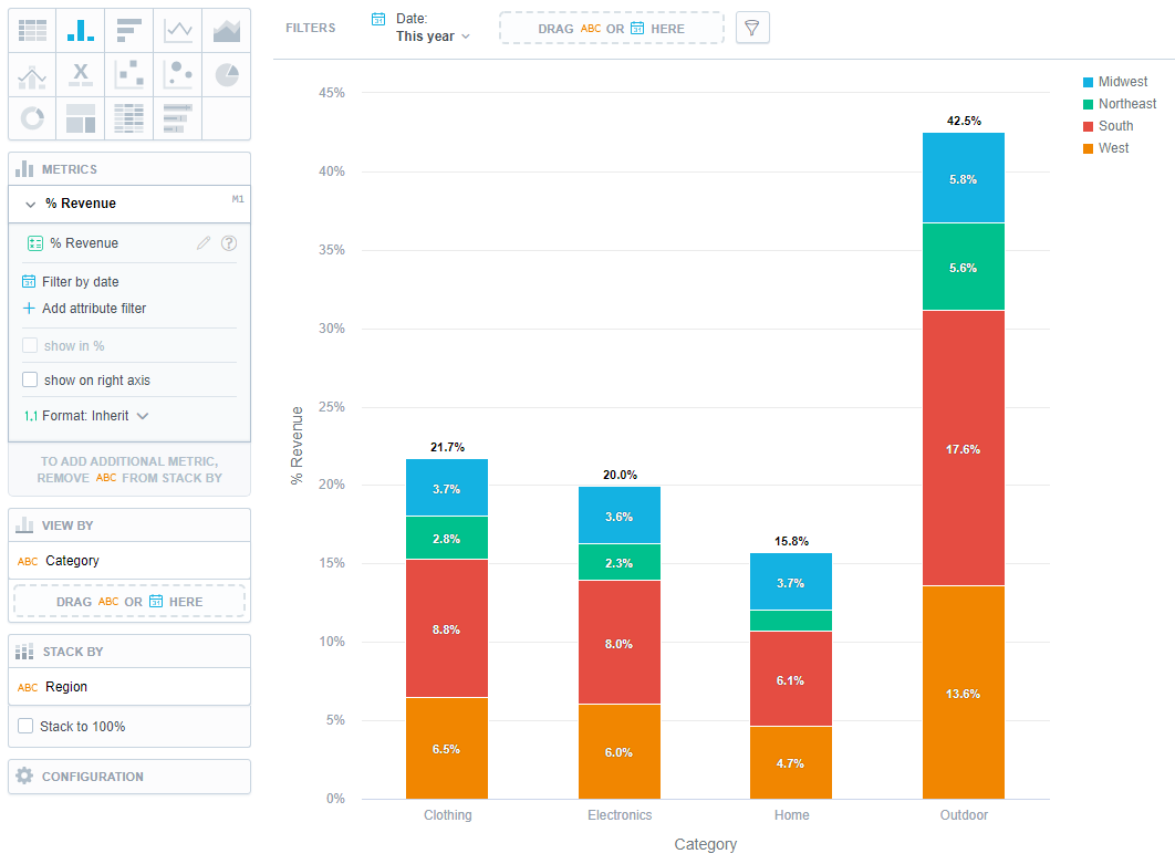
Drag a metric or an attribute from Data Catalog onto any drop zone to visualize it.
By default, the visualization displays the metrics in a column chart and attributes in a table. You can change the type of the visualization later.
To change the visualization type, click the appropriate icon at the top.
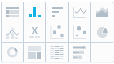
You can display the visualization as a table or different types of charts.
Different charts require different types of data. If you change the chart type, the visualization may change the displayed data as well.
For example, you can set a Stack by for a column chart, but not for a pie chart.
For details about different types of visualizations, see Visualization Types.
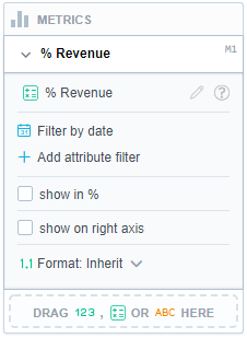
Select options in the Metrics settings.
Note
You can create new metrics or edit existing ones without having to stop working on your visualization, see Metric Editor in Analytical Designer.
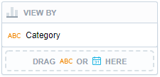
To add granularity to the displayed data, drag an attribute to the View by/Trend by section.
If you do not see the View by/Trend by section, try to change the type of the visualization.
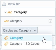
If you add Attributes, you can select which attribute label should be used to display the attribute values (the Display as option).
Note
You must define the additional attribute labels in your logical data model. See Manage Labels.
To split the display into a stacked chart, drag an attribute to the Stack by/Segment by section.
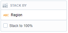
If you do not see the Stack by/Segment by section, try to change the type of the visualization.
To use Stack by (or Segment by for line charts), the visualization must have only one item in the Metrics section.
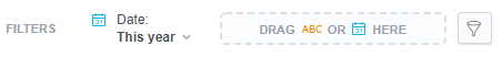
Add filters to the visualization.
You can drag and drop attributes to the top bar to filter the whole visualization.
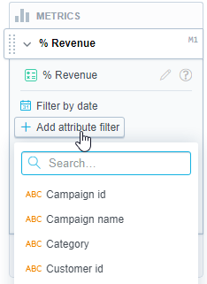
Add filters to individual metrics.
You can filter each metric by up to 20 attributes. All filters are applied at the same time (the
ANDoperator).The resulting visualization matches all the applied metric level filters.
Save the visualization.
When you have finalized your visualization:
Use the Save button to save it.
Use the Undo and Redo buttons in the top bar to browse through your edits.
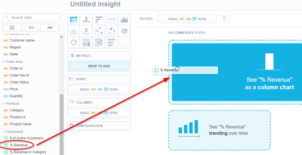
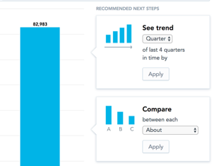
Recommendations
As you create visualizations, Analytical Designer offers you Recommended next steps.
The recommendations that appear when you add metrics and attributes are based on actions that GoodData users typically perform in similar analytical scenarios:
Edit a Visualization
Follow these steps to edit an existing visualization.
Steps:
Click Open in the top bar.
Select the visualization to edit.
The visualization opens for editing.
Delete a Visualization
Follow these steps to delete a visualization.
Steps:
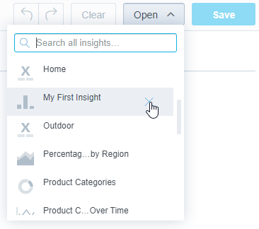
Click Open in the top bar.
Hover over the visualization that you want to delete.
Click the cross icon next to the visualization name.
Confirm the deletion
The visualization is deleted.