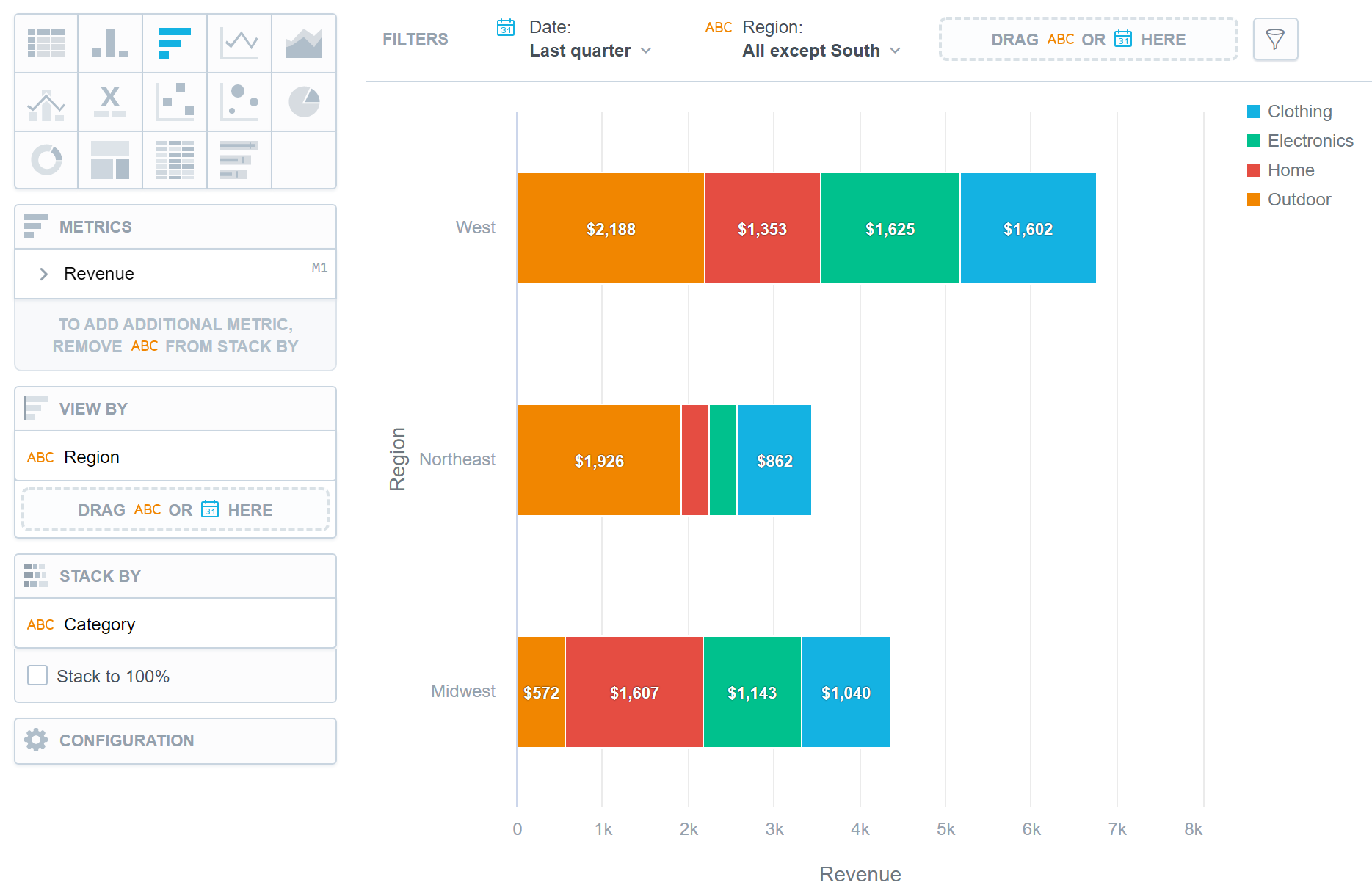
Bar Charts
Bar charts show your data in horizontal bars.
Bar charts have the following sections:
- Metrics
- View by
- Stack by
- Configuration
In bar charts, you can also:
Display the values as a percentage.
To do so, add a date or attributes to the View by section.
Stack the chart by attributes.
To add attributes to the Stack by section, you must have only one item in the Metrics section.
If you have multiple metrics in the Metrics section, you can stack the metrics. For details, see Stack Metrics.
Compare your data to the previous period or the same period of the previous year.
For details, see Time over Time Comparison.
Display a secondary x-axis at the top.
To do so, select the show on top axis checkbox in a metric’s settings.
If a bar chart is sliced by an attribute, the data is sorted by this attribute’s value. If a bar chart is stacked, it is sorted by the total value of the bars.
For information about common characteristics and settings of all visualizations, see Visualization Types.