Pivot Table
Pivot tables expand the capabilities of regular (flat) tables by allowing you to reorganize and summarize selected data beyond the typical row-column relationship. They are typically used for analyzing sales data by region, summarizing survey responses by demographic categories, examining website traffic by source, or tracking expenses by category and month.
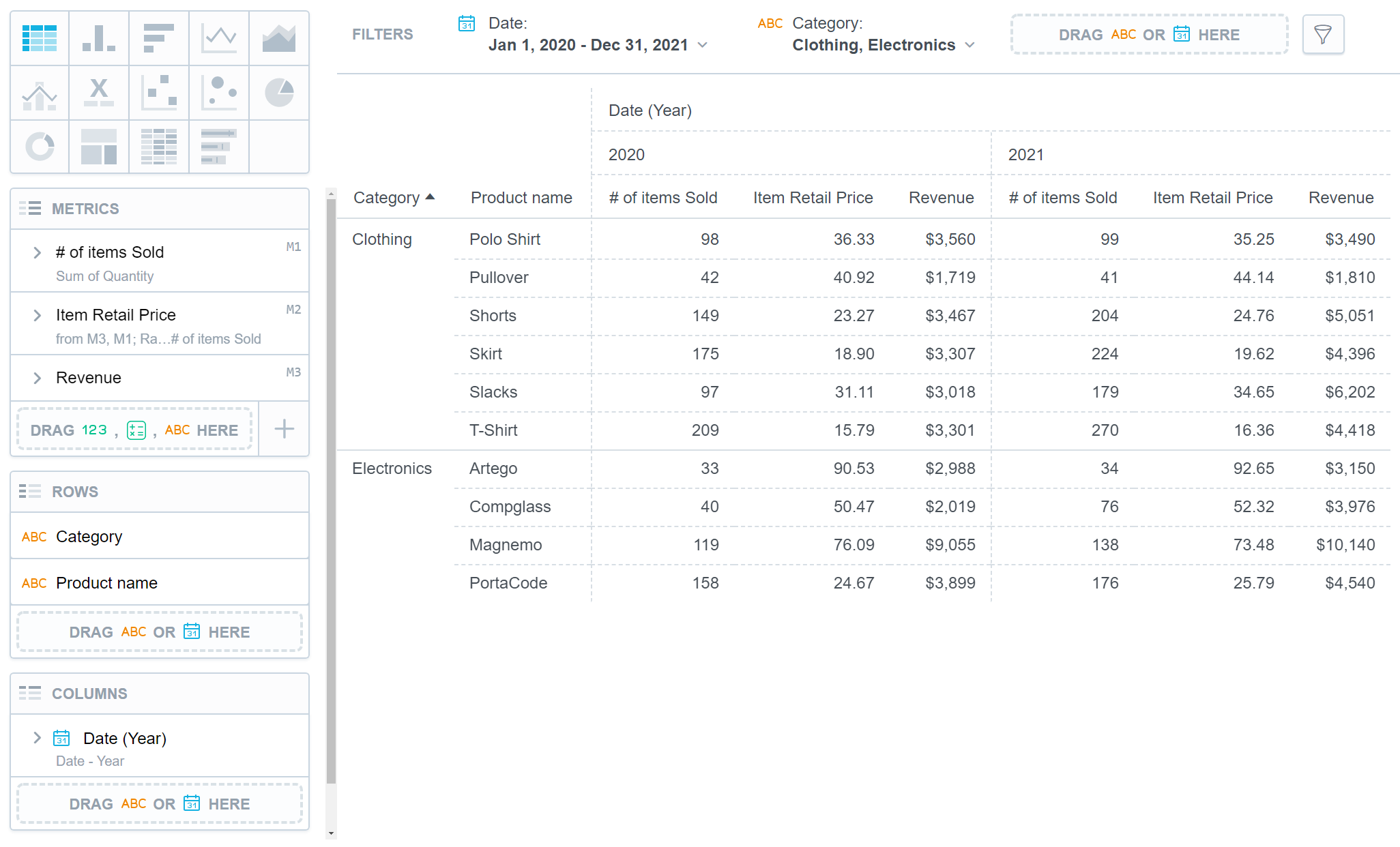
A pivot table can have up to 20 attribute rows and 20 attribute columns which refine data in your visualization. The data is then merged according to the attribute order in the Rows/Columns sections.
Pivot tables have the following sections:
- Metrics
- Rows
- Columns
- Configuration
In pivot tables, you can also:
Display the values as a percentage.
Compare your data to the previous period or the same period of the previous year.
For details, see the Time over Time Comparison section.
Group data when sorted by the first item in the Rows section.
Change the orientation of the table.
If you are using metrics, set the orientation of the table in Configuration > Metrics > Position. You can also change the orientation of the table by swapping attributes between the Rows and Columns sections.
If there are no attributes in the Rows section, you can also use Configuration > Column Headers > Position to change column headers into row headers and vice versa.
Pivot tables automatically adjust the width of the visible columns according to the cell content. The size is calculated according to the content in the header of the column that represents the lowest level of the grouped attributes.
For information about common characteristics and settings of all visualizations, see the Visualization Types section.
Table Totals
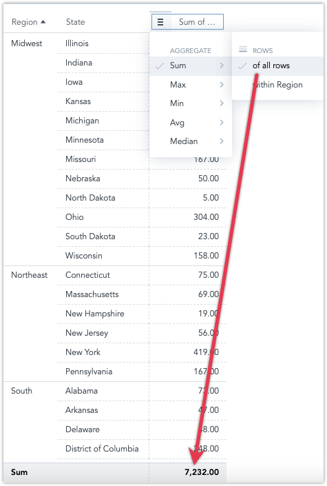
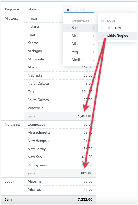
You can aggregate data in a table using the following aggregate functions:
SumMaxMinAvgMedian
Steps:
Create a pivot table.
For details, see the Create Visualizations section.
To add table totals, the table must include at least one item in the Metrics section and one item in the Rows section.
Hover the mouse over a column header.
A burger icon appears on the left side of the header.
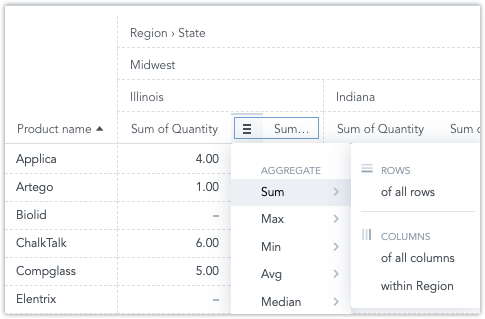
Click the burger icon and select an aggregate function.
A new row (or column, if applicable) with the function name and appropriate values under the column is displayed.
Note that you can also aggregate within individual attributes.
To add aggregate functions to all columns or to individual attributes or metrics, hover your mouse over column headers to display the burger icon.
The following image shows the
Sumfunction added in theYearattribute and theAvgfunction added in theCheckoutsmetric.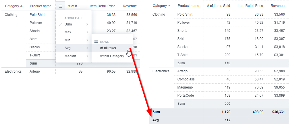
To delete an aggregate function, click the burger icon and click an already-selected function (with a tick sign) to hide the function row.
Limitations
If you show metrics in rows, you can display up to 1000 data elements horizontally. Similarly, if metrics are arranged in columns, the data element limit applies vertically.
Sorting is not available in rows containing metrics.
If you change column headers into row headers, the columns that were manually resized return to their default width. This cannot be further modified manually.